


Color is an essential element in all forms of visual communication, from graphic design and art to interior design and fashion. Understanding color theory is critical for designers, artists, and anyone involved in creating visual content. In this article, we will explore the fundamentals of color theory, including the basics of color, color harmony, color psychology, and how color can be used in the design.
The Basics of Color Theory
All Heading
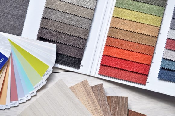
Color is a visual sensation created when light reflects off an object and enters our eyes. The human eye can perceive millions of colors, which can be organized into a color wheel. A color wheel is a circular diagram that shows the relationship between colors. The primary colors are red, yellow, and blue. They cannot be created by mixing other colors. Secondary colors are green, orange, and purple, which are created by mixing two primary colors. Tertiary colors are created by mixing a primary and a secondary color.
Color Harmony
Color harmony refers to the arrangement of colors in a visually pleasing way. There are several types of color harmony, including monochromatic, complementary, analogous, triadic, and tetradic.
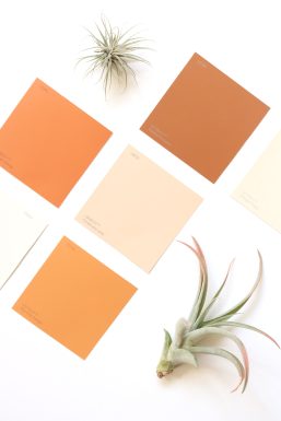
Monochromatic color harmony involves using different shades of the same color. This creates a subtle and sophisticated effect and is commonly used in minimalist design.
Complementary color harmony involves using colors that are opposite each other on the color wheel, such as red and green or blue and orange. This creates a high-contrast effect and is commonly used in advertising and branding.
Analogous color harmony involves using colors that are next to each other on the color wheel, such as red, orange, and yellow. This creates a harmonious and calming effect and is commonly used in interior design.
Triadic color harmony involves using three colors that are evenly spaced on the color wheel, such as red, yellow, and blue. This creates a vibrant and dynamic effect and is commonly used in fashion design.
Tetradic color harmony involves using four colors that are two complementary pairs. This creates a complex and balanced effect and is commonly used in graphic design.
Color Psychology
Color psychology is the study of how colors affect human behavior and emotions. Different colors can evoke different emotions and feelings in people. For example, red is associated with passion, energy, and excitement, while blue is associated with calmness, trust, and reliability.
In design, understanding color psychology is essential as it can influence how people perceive a brand, product, or service. For example, using red in a restaurant logo can evoke a sense of hunger and passion, while using blue in a healthcare logo can evoke a sense of trust and reliability.
Using Color in Design
Color is a critical element in the design, and understanding how to use it effectively is essential. This can make or break your branding. Here are some tips for using color in design:
1. Consider the Context
The context in which color is used can significantly impact how it is perceived. For example, a bright red background might work well for a high-energy sports brand but may be overwhelming for a healthcare website. Keep in mind what you want to achieve while using different colors.
2. Use Contrast
Contrast can create visual interest and help important elements stand out. Using a light color on a dark background or vice versa can create a striking effect. This is a great approach for your branding.
3. Use Color Consistently
Using a consistent color palette can help create a strong brand identity and make visual communication more cohesive. This will give your brand a professional look.
4. Don’t Overdo It
Using too many colors can be overwhelming and confusing. It’s best to stick to a limited color palette and use color sparingly. Using too many colors can look tacky and unprofessional. If you use just a few colors your audience will immediately recognize your brand.
In conclusion, understanding color theory is essential for anyone involved in visual communication. By understanding the basics of color, color harmony, and color psychology, designers and artists can create visually compelling designs that evoke the desired emotions and perceptions. By using color effectively and consistently, designers can create a strong brand identity and communicate their message more effectively.


Recent Comments