


You have probably heard a lot about typography and fonts, but may be surprised about a few elements that you might be overlooking when it comes to using them on your website. It might seem like choosing a font is a quick, minor step in your website design process, but with so many options available, it can be hard to narrow the choice down. Stick around, because this blog post will tell you everything you need to know about choosing the right font among a rich Google Fonts library, as well as further explain some additional utility elements you need to take into consideration.
1) Consider your product branding and audience
All Heading
The first step starts with research. If you have not already done so, it is important to understand the taste or aesthetics that are most appealing to the users that will be interacting with your brand. It is also a good idea to take a look at the fonts your competitors are using. Do you want to establish yourself as a clear part of a certain industry or do you want to stand out and shake things up? Knowing what your users resonate with, along with the unique differentiators you want to highlight on your product, is the first step when it comes to aligning your audience and brand through your font choice.
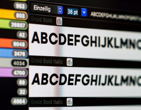
2) Font scalability and readability
Typography is both utility and art. For maximum utility, the font’s readability is its most important feature. Fonts should be easily readable, regardless of size. When choosing the most optimal font from Google Fonts for websites directory, you should consider context, as well as how a certain font looks on a phone screen versus on a desktop. Do not forget to check its readability in dark mode, as well as apply a typographic scale on the font.
3) Font loading time
Something many UX designers rarely consider when creating their static mockups is website loading time. The performance cost of the fonts we choose can have a huge impact on both user experience and business goals, which is why you need to take the fonts you have used in your design and implement the files to be rendered in the browser. Another way to help reduce font loading time on your website is to only download and use the font weights that you need. This means that sticking to perhaps three or four major typography choices Google Fonts for websites offers for your design is a good rule of thumb.
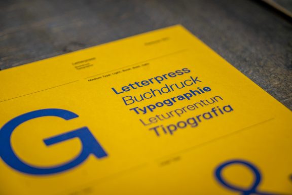
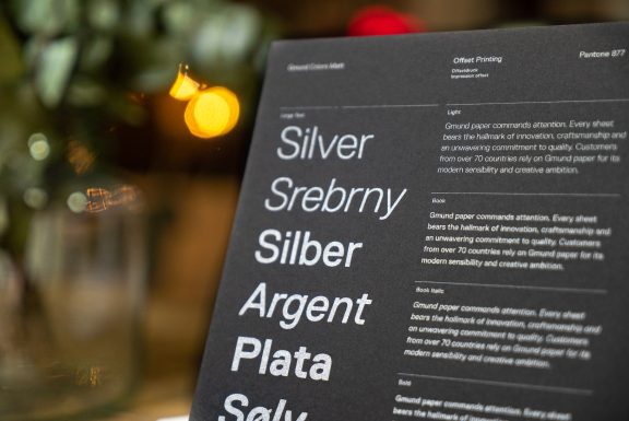
4) Font families, style, and combining fonts
Based on your user research and competitive analysis, you will want to match your fonts’ personality to your brand’s aesthetic. You can usually make more sense of font personality when taking a closer look at the letter forms, whether it is a serif, sans serif, or handwritten font type. Choosing a font that comes from a large family of Google Fonts for websites is a great idea, as it gives you more sizes and style options to play with, within the same family, so that your fonts automatically match and look good together.
Conclusion
While typography is a nuanced subject, choosing the right font does not have to be a tedious task that will give you a headache. While keeping your product branding and audience in mind, do not forget to consider your fonts’ readability, as well as their loading time in browsers. With the help of the previously listed tips, we are sure that you will build your confidence in selecting and pairing fonts, therefore making your website stand out in an ever-changing market.


Recent Comments