


Have you ever walked into a store and suddenly felt calm or excited? That’s not by accident. It’s color psychology at work! Advertisers use colors to make us feel specific emotions. These feelings can affect what we buy. Isn’t that cool?
Colors talk to our brains. Not with words, but with feelings. Red makes things feel exciting. Blue makes us feel safe and relaxed. Let’s dive into how colors are used in ads and why they work so well!
Why Advertisers Love Color
All Heading
Color grabs attention faster than words. Our eyes catch colors quickly. So, in a world full of ads, bright and smart colors help products stand out.
Think about your favorite brands. Their logos and ads probably use colors that make you feel something. That’s on purpose!
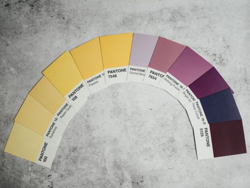
Popular Colors and What They Say
Each color has a vibe. Want to know what some colors usually mean in ads?
- Red: Energy, passion, hunger
- Blue: Trust, calm, professionalism
- Yellow: Cheerful, friendly, optimistic
- Green: Nature, health, peace
- Black: Power, luxury, elegance
- White: Clean, pure, simple
- Orange: Fun, excitement, creativity
- Purple: Mystery, royalty, imagination
These meanings can change in different parts of the world. For example, white means purity in the US, but it can mean mourning in some Asian cultures. So, businesses choose wisely!
Color and Buying Behavior
Did you know that color can influence if you buy something or not? It’s true!
In fact, about 90% of product judgments are based on color alone. Isn’t that wild?
Stores use this trick. Fast food places use red and yellow to make you feel hungry and excited. Tech companies love blue to seem smart and trustworthy. Nature brands? You guessed it—green all the way!
Examples You See Every Day
- Coca-Cola: Red – makes you feel excited and energetic.
- Facebook: Blue – calm and trustworthy.
- IKEA: Blue and yellow – welcoming and dependable.
- Starbucks: Green – friendly, peaceful vibes.
Even packaging uses color to get your attention. Think of cereal boxes. Bright reds, yellows, and blues jump off the shelves. Kids can’t resist!
How To Use Color Like a Pro
If you run a business or design things, here are some simple tips:
- Know your audience: What do they like? Are they fun-lovers or serious types?
- Use no more than 2-3 main colors: Too many colors can confuse people.
- Test what works: Try different colors for buttons or ads and see what gets clicks!
Color Isn’t Everything!
Now, let’s be real. Color is powerful, but it’s only one part of the story. Your message, design, and product quality matter too. So don’t rely on color alone.
But when used the right way, color can make your ad pop and help people remember you. That’s why smart advertisers love playing with the color wheel!
Final Splash of Color
Next time you see an ad, take a second look. What colors do you see? How do they make you feel?
Chances are, you’re feeling exactly how the advertisers want you to feel. And now, you know the secret: it’s all about the colors!


Recent Comments