Effective business intelligence (BI) goes beyond simply collecting data; it involves transforming information into actionable insights that guide strategic decisions. As organizations expand their analytics capabilities, intermediate-level BI exercises become essential for upskilling teams and ensuring data aligns with organizational objectives. In this article, we explore three critical components of intermediate BI: KPI design, cohort analysis, and dashboard development. These practices not only enhance analytical maturity but also support more informed, data-driven decisions across departments.
KPI Design: Defining What Really Matters
All Heading
Key Performance Indicators (KPIs) are the backbone of any performance measurement system. However, designing effective KPIs requires more than choosing generic metrics. It involves aligning indicators with strategic goals, ensuring clarity, and enabling action.
Elements of Good KPI Design:
- Aligned: KPIs should directly relate to organizational goals, such as increasing revenue or improving customer satisfaction.
- Actionable: Metrics must inform stakeholders of what steps to take next rather than simply reporting history.
- SMART Criteria: KPIs should be Specific, Measurable, Achievable, Relevant, and Time-bound.
- Minimal but Comprehensive: Don’t overload dashboards with every available metric—choose only those that provide genuine insights.
Start by identifying key objectives and asking the right questions. For example: “How do we measure user engagement in our app?” This leads to potential KPIs like average session duration, retention rate, or monthly active users. Each KPI should have a defined target or benchmark, set using historical data or industry standards.
It’s also crucial to establish clear ownership for each KPI. Who is responsible for monitoring it? Who acts on the results? A well-designed KPI without accountability can go unnoticed and add little value to decision-making efforts.

Cohort Analysis: Understanding Patterns Across Time
Cohort analysis is a powerful yet often underutilized BI technique that uncovers user behavior across defined groupings over time. It allows businesses to study how different segments evolve, particularly important for driving strategic initiatives in product adoption, marketing, and customer retention.
What Is a Cohort?
In BI, a “cohort” typically refers to a group of users or entities that share a common characteristic within a defined time period. For instance, users who signed up for a subscription product in January form one cohort. This group can then be tracked across later months to understand retention, engagement, or monetization patterns.
Types of Cohort Analysis:
- Behavioral Cohorts: Grouping based on actions taken (e.g., downloaded an ebook, completed onboarding).
- Acquisition Cohorts: Grouping based on when users were acquired (e.g., by signup month).
- Time-Based Cohorts: Grouping by time intervals to understand activity over comparable periods (e.g., day 0, week 1, week 2).
By examining cohort behavior, you can answer questions like:
- How long does it take for new users to make their first purchase?
- Are users acquired through a particular campaign more loyal?
- Do retention rates differ seasonally?
Intermediate BI professionals can implement cohort analysis using tools like SQL, Excel pivot tables, or dedicated BI platforms like Tableau or Power BI. Advanced calculations may involve tracking metrics like LTV (Lifetime Value) or CAC (Customer Acquisition Cost) over cohort timelines.
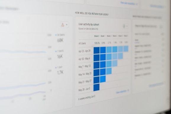
One frequently used visualization is the cohort matrix, where rows represent cohorts (e.g., signup month) and columns show time periods (e.g., months since signup). The values reveal trends such as consistent drop-offs or performance spikes, enabling data-driven decision making.

Dashboards: Bringing Data to Life
Dashboards are the primary way most business users interact with BI outputs. A well-crafted dashboard doesn’t just display numbers—it tells a story. Intermediate BI developers must move beyond basic charts and create dashboards that are intuitive, contextual, and interactive.
Best Practices for Dashboard Design:
- Know Your Audience: Executives need summary-level KPIs; analysts may want to dive deeper into trends and drivers.
- Focus on Business Questions: Structure your dashboard around specific questions, such as “How are we performing regionally?” or “Why did conversion rates drop last quarter?”
- Use Visual Hierarchies: Place the most important visualizations at the top and use consistent color schemes to guide the eye.
- Enable Interactivity: Use filters, drill-downs, and tooltips to allow users to explore data on their terms.
- Avoid Visual Clutter: Too many complex charts can overwhelm users. Stick to bar charts, line graphs, and heatmaps where possible.
Remember to develop dashboards iteratively. Gather feedback from users, test usability, and refine over time. The best BI dashboards are living products, not one-time reports.
Key Metrics You Might Include:
- Conversion Rate by Channel
- Customer Retention Over Time
- Gross Margin by Region
- Net Promoter Score (NPS) Trends
To build advanced dashboards, you can use tools such as Microsoft Power BI, Tableau, or Looker. These platforms support integrations with multiple data sources, real-time updates, and improved user experience via responsive design.

Integration of Exercises Into BI Training
Incorporating these exercises into BI training programs helps teams develop both technical and strategic capabilities. Consider the following structure for launching an intermediate BI workshop:
- Intro to KPI Strategy: Participants define KPIs for a mock company based on business goals.
- Cohort Analysis With Real Data: Analyze user retention using a real or simulated dataset.
- Hands-On Dashboard Design: Build dashboards in Power BI or Tableau that present the KPI and cohort results effectively.
Encourage peer reviews of each exercise, where participants critique each other’s KPI choices or dashboard layouts. This fosters a deeper understanding of analytic storytelling and data presentation.
Conclusion
As organizations mature in their use of business intelligence, moving toward intermediate-level exercises like KPI design, cohort analysis, and dashboard creation becomes critical. These activities ensure analytics are not just technically sound, but aligned with strategic goals and accessible to decision-makers across the business. Developing these skills empowers teams to extract deeper insights, drive continuous improvement, and ultimately gain a competitive edge through data-informed strategies.
In BI, progress is iterative, and each dashboard or metric refined brings your organization one step closer to data excellence. Investing time into these intermediate exercises will prepare analysts and stakeholders alike for the advanced data challenges that lie ahead.


Recent Comments